7 Landing Page Examples That Drive Conversions
In today’s competitive digital landscape, standout landing page examples can make all the difference between a click and a conversion. Whether your goal is to collect leads, drive signups, or promote an event, the best landing pages share common design, copy, and UX principles. We’ll explore seven real-world examples that drive impressive results, then show you how to create your own high-converting pages fast with Landingi.
Why Study Landing Page Examples?
When you review top-performing landing page examples, you uncover proven patterns for headlines, CTAs, trust signals, and layouts. These examples serve as creative springboards—helping you avoid guesswork and reduce testing time. With a clear blueprint, you can boost your conversion rates and generate more leads or sales.
Key Elements of High-Converting Landing Pages
Every successful page includes:
- Compelling Headline – Clearly states the value proposition in one punchy sentence.
- Focused CTA – A single, bold call to action that guides the visitor’s next step.
- Trust Signals – Social proof, testimonials, reviews, or security badges to build credibility.
- Concise Copy – Short paragraphs, bullet points, and subheads that communicate benefits quickly.
- Visual Hierarchy – Guiding the eye from headline, to hero image, to CTA button.
- Responsive Design – Optimized for mobile, tablet, and desktop views to reach every visitor.
1. SaaS Free Trial Sign-Up
This page offers a no-risk free trial with minimal form fields (name, email, company). The hero headline promises “Get 14 Days Free—No Credit Card Required,” removing friction. Below, three concise bullet points highlight speed, ease of use, and customer support. A bright, contrasting button invites clicks. Notice the small logos of well-known clients to reinforce credibility.
2. Webinar Registration Page
The headline clearly states the topic, date, and time: “Join Our Live Webinar: 5 Secrets to Boost Conversions.” A countdown timer creates urgency, while a simple form asks for only essential data (name and email). A brief bio of the presenter, alongside a professional headshot, boosts trust. At the bottom, an FAQ section alleviates last-minute objections.
3. E-Book Download Offer
Here, the page promotes a free e-book titled “Ultimate Guide to Email Marketing.” A vibrant cover image draws attention, and the subheadline explains what readers will learn in five quick bullets. The CTA button, “Download My Free Copy,” uses first-person language to enhance personal connection. Visitor testimonials marked with star ratings add social proof.
4. Product Launch Pre-Order
Anticipation is the name of the game. This page teases a new gadget with sleek renderings, a countdown to launch date, and “Be the First to Pre-Order” as the CTA. Benefit-driven bullet points outline features like battery life, durability, and warranty. A live chat widget offers real-time answers, reducing purchase anxiety.
5. Event Ticket Sales
A local conference page uses vibrant event imagery, date and location details at the top, and a tiered pricing table to drive urgency (“Early Bird ends in 3 days”). The CTA button reads “Reserve Your Seat,” and a section of past-attendee testimonials reassures new prospects of the event’s value. Mobile-optimized design ensures easy ticket purchases on any device.
6. Consultation Booking
Professional services firms often use simple calendar widgets embedded directly on the landing page. Here, a headline promises “Free 30-Minute Strategy Call,” and a short paragraph details what’s covered in the session. An adjacent bullet list highlights the expert’s credentials and past success stories. After filling out basic info, visitors pick an appointment slot—no back-and-forth emails required.
7. App Download Promotion
For mobile apps, a clean hero section shows the app in action on a smartphone mockup. The headline reads “Get Fit Faster with Our AI Coach”—tying into real user goals. Below, three short benefit statements appear with matching icons (personalized workouts, progress tracking, community support). Store badges for iOS and Android are prominently placed next to the CTA buttons.
How to Build These Pages Yourself with Landingi
Rather than coding from scratch, use Landingi’s intuitive drag-and-drop platform to replicate and customize these winning landing page examples:
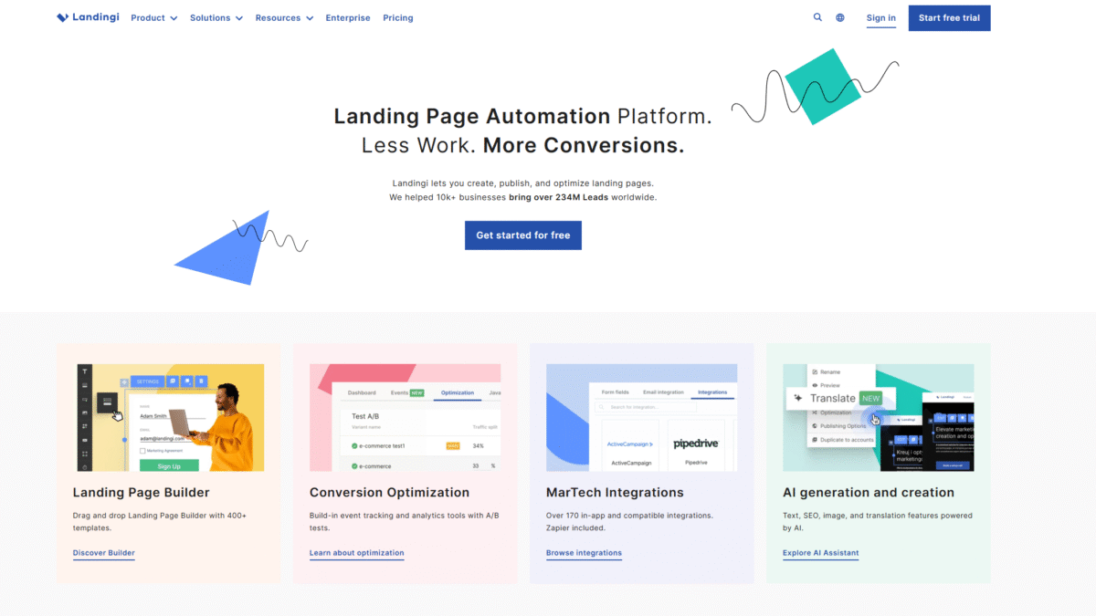
- 400+ Templates – Start from proven designs and tweak copy, colors, and images in seconds.
- Smart Sections – Apply changes across multiple pages at once for consistent branding.
- AI Assistance – Generate persuasive headlines, SEO-optimized text, and even images without leaving the builder.
- EventTracker – Capture micro-conversions (button clicks, video plays) automatically in your dashboard.
- 170+ Integrations – Sync leads with CRM, email marketing, webinar platforms, and analytics tools via Zapier or direct connectors.
- Figma Plugin – Import your Figma designs directly into Landingi and launch your page without further tweaks.
- Responsive Cloud Hosting – Every page is lightning fast and mobile-friendly out of the box.
Ready to launch your own high-impact landing pages? Try Landingi Free for 14 days Today and start turning traffic into conversions—no coding required.
Tips for Faster Results
- Run A/B tests on headlines and CTAs using built-in analytics.
- Leverage AI-generated copy for rapid iterations.
- Use testimonial carousels or video snippets to build social proof.
- Keep your forms short and sweet—ask only for essential details.
- Implement exit-intent pop-ups to capture abandoning visitors.
Conclusion
By studying these seven landing page examples and applying the best practices outlined above, you’ll be well on your way to higher conversions and better ROI. With Landingi’s no-code builder, AI assistance, and powerful optimization tools, you can roll out professional landing pages in minutes. Try Landingi Free for 14 days Today and watch your conversion rates soar.
