
Landing Page Examples That Boost Conversions
Searching for stunning landing page examples that drive real results? You’ve come to the right place. In this comprehensive guide, I’ll walk you through ten of the most effective landing page examples and show you how teams everywhere build them with Landingi to maximize conversions.
Why Effective Landing Pages Matter
Every click your ad or social post earns is precious—and landing pages are where prospects decide to become leads. A strong landing page distills your offer, focuses visitor attention, and guides them toward one clear action. Without it, you risk high bounce rates and wasted ad budget.
By studying landing page examples that work, you can uncover design patterns, psychological triggers, and copy tactics that persuade visitors. Then you can adapt those insights to your own campaigns, ensuring every visitor has the best chance to convert.
10 Landing Page Examples That Boost Conversions
Below are ten real-world landing page examples that excel at clarity, trust-building, and driving action. Note what each one does right—and think about how you can replicate their strategies.
1. Dropbox – Simplified Sign-Up
Dropbox nails simplicity. The headline (“All your stuff, anywhere”) communicates the value instantly. A minimalist form asks only for an email address. Users aren’t distracted by navigation menus or extra links, so they focus on signing up.
- Bold, benefit-driven headline
- Single-field form reduces friction
- Subtle progress animation keeps users engaged
2. Slack – Clear Social Proof
Slack’s landing page highlights logos of well-known customers (“Used by 750,000+ teams”). This social proof immediately builds trust. The call-to-action button stands out in a vibrant color, and a secondary video tour link caters to those who need more reassurance.
3. Airbnb Host Sign-Up – Emphasis on Earnings
Airbnb persuades potential hosts by leading with a concrete benefit: “Earn up to $9,000 per month.” Visuals of beautiful spaces and a step-by-step process infographic guide users through the easy sign-up process.
4. Shopify Trial Page – Urgency and Simplicity
Shopify offers a 14-day free trial with no credit card required. A concise headline and subheadline explain the promise (“Start selling in minutes”). The form collects minimal information, and a progress bar at the top reinforces how close you are to launching your store.
5. Unbounce – Focused A/B Test Invitation
Unbounce, a landing page platform itself, invites you to “Build & Publish in Minutes.” They spotlight a free trial and use animated gifs to show real-time page editing. The clean layout and strong color contrasts guide eyes to the trial button.
6. Trello – Visual Organization Appeal
Trello’s page uses colorful cards and simple icons to illustrate how the tool organizes tasks. A large headline explains the benefit (“Trello helps teams move work forward”), while a “Sign Up – It’s Free” button remains visible at all times.
7. Grammarly – Problem–Solution Structure
Grammarly addresses a common problem (“Write the best version of yourself”) and shows a quick demo of its grammar suggestions in action. A prominent “Add to Chrome – It’s Free” button removes any confusion about the next step.
8. HubSpot – Premium Content Offer
HubSpot’s landing page for an eBook download highlights a compelling title and bullet points of what readers will learn. A form with only four fields collects qualified leads, and trust badges at the bottom reassure users of data privacy.
9. Evernote – Multi-Column Layout
Evernote uses a split-screen layout: one side lists benefits with icons, the other shows the app in action. The CTA (“Sign Up for Free”) appears both above and below the fold, ensuring visitors never have to scroll too far.
10. Mailchimp – Personality-Driven Design
Mailchimp leverages its brand mascot and playful copy to create a memorable experience. The headline “Grow Better” is aspirational, and a bright button invites visitors to “Sign Up Free,” leading them to a frictionless registration process.
Key Takeaways from Landing Page Examples
- Singular Focus: Eliminate distractions—remove navigation and extra links.
- Clear Value Proposition: Use benefit-driven headlines that speak directly to user needs.
- Minimal Forms: Ask only for essential information to reduce abandonment.
- Trust Signals: Include logos, testimonials, and privacy assurances.
- Compelling Visuals: Use images, videos, or animations that illustrate the product in action.
- Strong CTAs: Choose contrasting button colors and action-oriented text.
How to Build Your Own High-Converting Landing Page
Now that you’ve seen what works, it’s time to craft your own. Follow these steps:
- Define your goal and audience.
- Create a compelling headline that highlights a key benefit.
- Design a minimal layout—prioritize clarity over complexity.
- Add social proof with testimonials or client logos.
- Write concise, persuasive body copy that breaks up text into scannable chunks.
- Test button colors, headlines, and form lengths with A/B experiments.
Ready to get hands-on? Try Landingi Free for 14 days Today and access over 400 templates, drag-and-drop editing, and built-in A/B testing to launch your page in minutes.
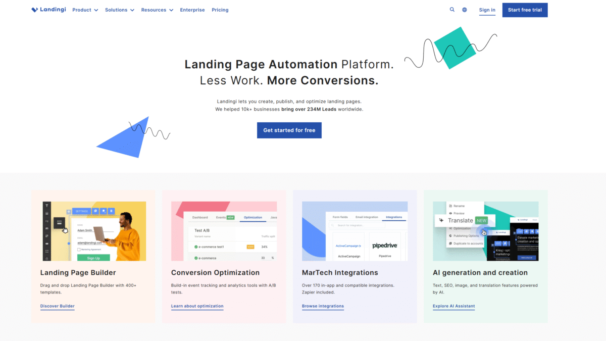
Why Choose Landingi for Your Next Campaign
Landingi is a no-code landing page builder designed for marketers who want speed and performance. Here’s why it stands out:
- 400+ Templates: Start with professionally designed layouts for every industry.
- Drag & Drop Builder: Customize sections, fonts, and images without a developer.
- A/B Testing & Analytics: Track micro-conversions, view heatmaps, and optimize on the fly.
- Smart Sections: Apply global changes across multiple pages in one click.
- 170+ Integrations: Connect to your CRM, email platform, or use Zapier for custom workflows.
- AI Assistance: Generate headlines, SEO-optimized text, and image edits directly in the builder.
- 100% Human Support: Reach out via chat, email, or phone to our real support team.
Conclusion
High-converting landing page examples share common traits: clear messaging, minimal forms, strong CTAs, and trust signals. By studying these examples and leveraging a powerful no-code platform, you can accelerate your campaign performance and capture more leads.
Start creating your own conversion-optimized landing pages today. Try Landingi Free for 14 days Today